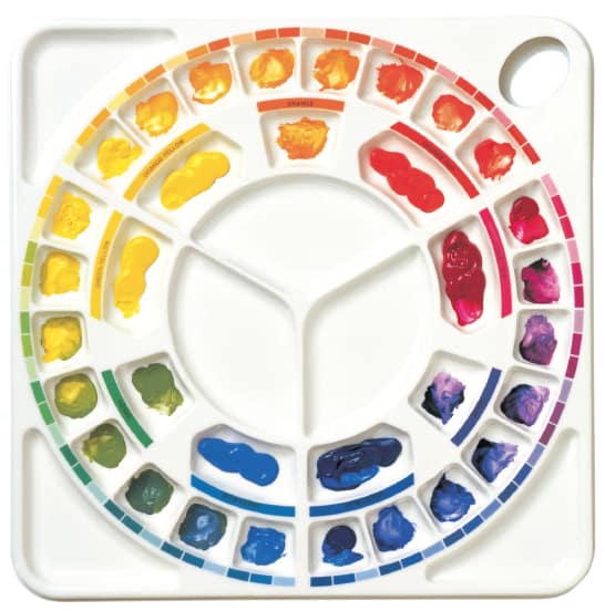
For most artists the mixing of colour is pure guess work – trial and error and more often than not, error! Our colour Mixing Palette, together with an understanding of what actually happens when colours are mixed, has enabled countless artists of to mix their colours with confidence. Once the basics have been mastered, the ‘trials’ become enjoyable and the ‘errors’ become a thing of the past.
In the associated article, Mix Greens With Confidence – part one I suggest that you think of green as an ‘impurity’ in any blue or yellow. Blues such as Cerulean or Phthalocyanine ‘carry’ a lot of this ‘impurity’, as does a yellow such as Hansa (Lemon) Yellow. On the other hand, Ultramarine Blue and Cadmium Yellow carry very little green.
When any yellow or blue are mixed, the ‘blueness’ and ‘yellowness’ disappear leaving behind the green ‘impurity’. Hansa Yellow and Cerulean Blue, for example, make a relatively bright green as they are both good ‘carriers’ of green. Cadmium Yellow and Ultramarine Blue make dull, dark greens as they are poor ‘carriers’. A wide range of reliable and predictable greens can easily be produced this way.
But there soon comes a time when we need to darken such greens. If black is added it destroys the very nature of the greens. We need to identify and use the complementary colour to green, which is red. Many artists know that red and green are complementaries, but which red and which green? Any red will darken any green but the results will often be unpredictable.
In order to keep a green close to its original character as it becomes de saturated we must choose the type of red with care. It is always worth while choosing the natural mixing partner if you wish to rake full control of the situation. The palette has been designed to identify the mixing partner for you as you work.
Yellowish Green

A bright yellowish green does not become a darker yellowish green with black, but more of a drab khaki looking colour Control of colour mixing is immediately lost. We need to find a way of reducing the amount of green which is reflected if the colour is to lose its intensity. The ideal way to do this is to add the mixing partner.
Hansa Yellow

As I have mentioned a bright yellowish green, let’s start off with this colour Hansa Yellow and Cerulean Blue will give a relatively bright green. If extra yellow is added we naturally end up with a yellow green.
To darken this colour, simply look for the outer mixing well which has a printed colour guide nearest to the yellow – green. Do not look for an exact match, simply select the nearest. Put the yellow-green paint into the well and look opposite on the palette for the ‘mixing partner’. This is found to be violet-red.
Violet-red absorbing yellow-green

As small amounts of the violet-red are added to the yellow-green the colour darkens, or becomes less saturated. Think of the violet-red acting on the yellow-green almost like a dimmer switch, turning down the yellow-green light. Violet-red is very effective at absorbing yellow-green.
Mixing a Blue Green

Let us now mix a blue-green and seek its mixing partner. A relatively bright blue-green will emerge from a mix of Hansa Yellow (which from now on we will call a ‘green-yellow’) and Cerulean Blue, a ‘green-blue’.
The mixed blue green is placed into the appropriate mixing well, using the printed colour guide. Its mixing partner, an orange-red (not just any red), lies opposite on the palette.
Adding Orange-Red

As the orange-red is added to the blue-green it again acts like a dimmer switch, turning down the blue-green light. This is a useful analogy as all colours are reflected light. Now let us add a little more blue to the mix, making it a very blue green. Its mixing partner is once again to be found opposite on the palette.
This time the partner moves from an orange-red to a reddish orange. (Ideally mixed from Cadmium Red Light and a little Cadmium Yellow Light). It is simply a case of selecting the most appropriate outer well and looking opposite on the palette.
There is a side benefit to selecting mixing partners (complementaries) with care. You can not only darken colours naturally and keep them in character but also produce a wide range of coloured grays. Such grays emerge when a complementary pair is mixed in or near equal intensity.
As the orange-red absorbs the blue-green, there comes a point when both colours mutually destroy each other. Not only does the red destroy the green, but the green absorbs the red.
Coloured Grays

At this point we are left with a series of coloured grays. We can use such darks as they occur or lighten them with white or through thin application. Such tints can be extremely subtle and when used with the original red and green, provide the basis for one approach to colour harmony.