Description
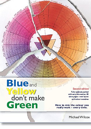
Translated in many languages, this book has become the best selling art book of all time!
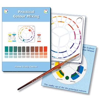
By understanding what really does happen when colours are mixed, you will be able to master colour mixing once and for all, and in a very short time. This new look at colour mixing is applicable to oils, acrylics, watercolour, gouache, pastels, coloured pencils, silk screen inks, textile inks and all arts and crafts which involve the use of colour.
By unravelling the many ambiguities and myths inherent in the established way of working, I have attempted to transform colour mixing from a haphazard affair into a thinking process. Allows reader to find out what really happens when colours are mixed.


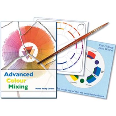
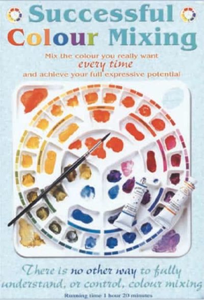
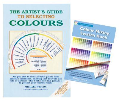

amazon –
Five Stars
I don’t get involved with commentary typically, but this book is exceptional. Simple and effective guidance to color.
By pastadna (AMAZON – Verified Purchase)
amazon –
Color theory explained.
EXCELLENT reference for all artist. Ever wonder why your mixes are a ugly color? This book explains it all. Need to be in you library.
By books-a-bazillion (AMAZON – Verified Purchase)
amazon –
Very good informationVery good information
Blue and Yellow do make Green! But various blues and various yellows make many different greens.
Had a lot of fun making up my own color charts.
By Jeff (AMAZON – Verified Purchase)
amazon –
understand color
A clear understanding of color mixing presented step by step with explanations about color on multiple levels. A must for any artist.
By Jill Collins (AMAZON – Verified Purchase)
amazon –
Will change your view of color
The first thirty-five pages will change your view of color. Blue and Yellow Don’t Make Green explains the common misperception – that paint colors “blend” to create a new color. In fact, a blue paint is not perfectly blue, and a yellow not perfectly yellow, so it matters a great deal which blue and which yellow you mix.
This book will explain why, and why we so often get mud instead of the color we expected from our charts or our limited understanding of how paint works. Read this, you will understand color a great deal more when you are done. Unlike so many other volumes, this is not a message repeated in every other painting book out there.
By Griswel (AMAZON – Verified Purchase)
amazon –
Good for beginners; good for professional artists
This book provides more than a color wheel; it tells how to get colors you want and to keep red and blue making purple and not ugly brown tones.
By Pat J (AMAZON – Verified Purchase)
amazon –
AMAZING
It is of invaluable help for both the professional and the amateur painter. Seek for color harmony and discovering how to achieve this goal becomes understanbly and easy.
By Jose Gama (AMAZON – Verified Purchase)
amazon –
Don’t throw the Color Wheel out yet!
As a webcartoonist, and digital painter, I found that there was helpful information in this book, but found it lacked in the basic theory of color combinations. I just know now not touse the same reb blue nd greens to get the colors I’m looking for. Also, the helpful sections on doing browns and greens helped a great deal for colors I have a hard time mixing on a screen. Overall, It was helpful for making my colors more like the lifelike counterparts I was trying to replicate.
By Equidna Rojo (AMAZON – Verified Purchase)
amazon –
a good technical resource
It is, I suppose, a reference book that every artist should possess and keep handy at all times. It is a book that I return to time and time again for assistance.
By Janie O’brien (AMAZON – Verified Purchase)
amazon –
Blue and Yellow Don’t Make Green
This is a great book for reference and reading through. It came through the mail promptly and in very good shape.
By Josena (AMAZON – Verified Purchase)
amazon –
This book will go down in history as foundational.
Artist have struggled with understanding color mixing since the 16th century as evidenced by the differing theories and opinions. The struggle to mix the color you want every time has continued in this century mostly because the traditional three primary color wheel, which is deeply embedded in our schools and other art classes, is incomplete and therefore limited in its use. As evidenced by countless and expensive piles of mud and just settling with “This will have to do” that frustrates many artist. With Michael Wilcoxs’ sound scientific background this is not a theory that can be argued. It is a fact and he explains how to use these facts in a logical method to base your decisions about mixing colors. You cannot go wrong by studying this book. However, if you already know the three primary color wheel, you will have to study and practice harder to unlearn the three primary and relearn the proper and more dependable way to mix color. If you do the work it will change your life. You will never have to struggle with guesswork and unknowns to get the color you want every time. Like I said, remember as you’re reading this book that you are a part of history bing made.
By A customer (AMAZON – Verified Purchase)
amazon –
Lost it in the suffle of art bilks but it …
Lost it in the suffle of art bilks but it turned up recently. Will use it as reference book in the near future.
By Kathryn A. Young (AMAZON – Verified Purchase)
amazon –
Ignore the Naysayers, They’re Just Wrong
This book offers the general reader a relatively detailed account of how light interacts with colored surfaces and why paint (and other media) behaves the way it does when mixed. It’s an account of how subtractive mixing works, featuring many illustrations, examples and demonstrations, as well as a series of colorwheels artists can reproduce for themselves in their quest to better understand their colors.
Unfortunately, the general American reader (especially those who lean towards the arts) is not very conversant with science and may find some of the concepts in this book rather opaque upon a first reading. This seems to be what has happened in in the cases of those who’ve given this book poor reviews. Without exception, they seem to have *completely* missed the basic premise of this book.
But if a reader makes the effort to read through again or work through it with a more left-brained friend, they will find a treasure trove of liberating information here.
It’s true Wilcox takes a different view of the best way to gray and darken colors than some more traditional painters. Each system has its advantages and disadvantages. But the science behind his six-primary system is unassailable, as those who’ve taken the trouble to reproduce his color charts can attest.
The six-primary system (which Wilcox calls “color bias” and Ledand calls “split primary”) works, plain and simple.
By E. Smyth (AMAZON – Verified Purchase)
amazon –
Very Helpful to Dyers as wells as Painters
When mixing dyes, I had been getting a large variety of browns when not desired.This book opened my eyes to why mixing colors can get an unreliable result.
Like most, I was taught color theory in grade school, and using wax crayons, this simple theory worked to uncritical grade school eyes. I am an amateur hand dyer, and I found that the colors I was mixing were very unpredictable. Now, after reading this book and it’s companion sample book, I find that I get much closer to the desired colors when working from pure dyes.
In cotton dyes, there four yellows, one orange, two reds, five blues, and two purples that are homogeneous or “pure” colors. This book went very far to explain how to pick the particular “pure” colors to mix to get the desired color, or close. Experimenting is still required to get proportions correct.
The theory and practice recommended in this text is NOT directly applicable to dyes, as paints are applied to the surface and dyes go into the material. Also the colors recommended are for paints, and some of the colors do not exist as pure colors in dyes. But the underlying theory is very useful and applicable to dyeing. I am very pleased that I found this book, it has helped me tremendously.
By L. Booth (AMAZON – Verified Purchase)
amazon –
Color Bias Wheel
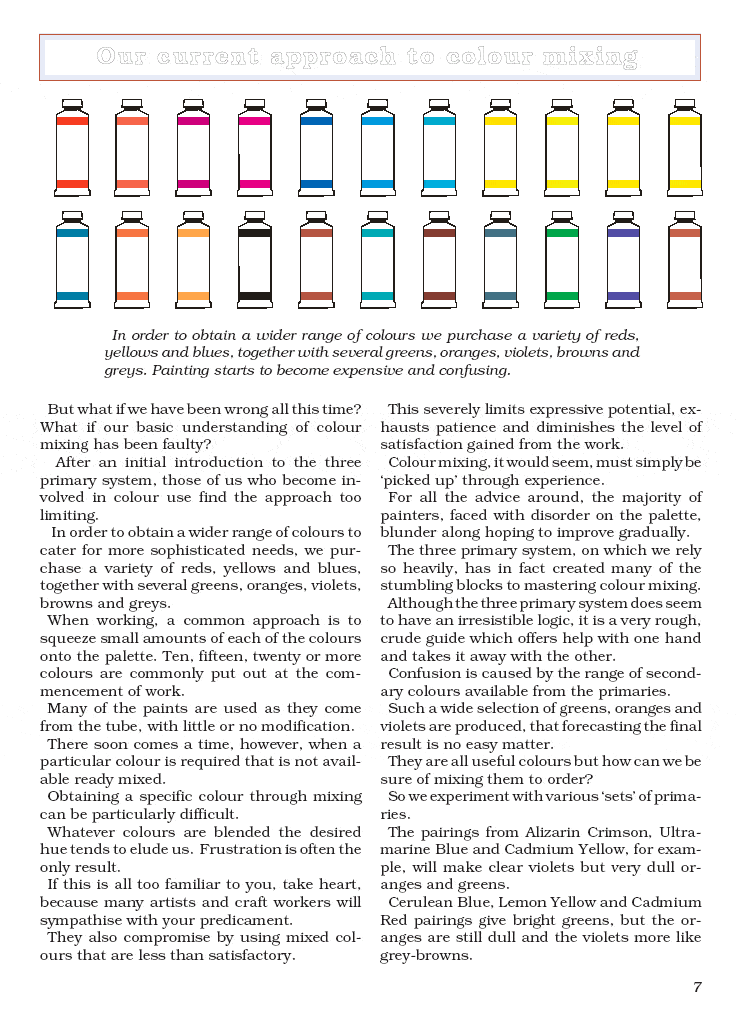
“Have you ever wondered why it is so difficult to mix the exact colors that you need? And why it is so easy to mix dull, grayed colors, commonly known as mud?… In order to obtain a wider range of colors we purchase a variety of reds, yellows and blues, together with several greens, oranges, violets, browns, and grays. Painting starts to become expensive and confusing.”
The main premise of this book is that the three-primary color system needs to be abandoned in favor a six-color system. To begin, we need to understand how portions of the color spectrum are either absorbed or reflected by a surface. A surface appears black because it absorbs all colors. A surface appears white if it reflects all colors.
So what happens if you mix pure yellow and pure blue? “The yellow pigment absorbs all light except yellow. The blue pigment likewise absorbs all but the blue portion of the light… The result is a dark gray, almost black. But how can this be? Everyone knows that blue and yellow make green. But blue and yellow do not make green.” They make black, because they absorb each other’s color. Likewise pure yellow and pure red make black; pure red and pure blue also make black.
“A yellow surface absorbs nearly all ‘color waves’ except the yellow which is rejected and reflected back from the surface to our eyes…If the yellow light reflected by the yellow pigment happens to meet up with another yellow particle, it is reflected again and is temporarily safe. If, however, it strikes a blue or red speck of pigment, it is absorbed.”
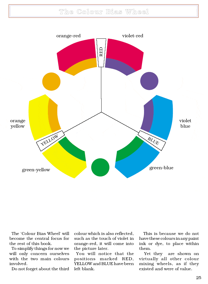
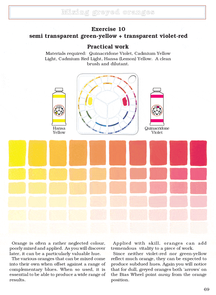
In practice, however, there are no pure primary pigments. So it is more helpful to understand the bias of pigments in order to predict how they will mix. “We have to change the way that we think.” The author introduces the Color Bias Wheel which consists of six color types:
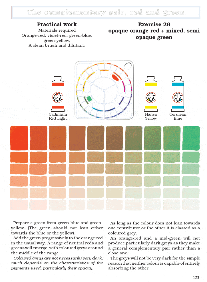
Orange-red such as Cadmium Red
Violet-red such as Quinacridone Violet or Alizarin Crimson
Violet-blue such as Ultramarine Blue
Green-blue such as Cerulean Blue
Green-yellow such as Lemon Yellow or Hansa Yellow
Orange-yellow such as Cadmium Yellow
What happens when you mix impure yellow and impure blue? “A green-yellow such as Hansa Yellow… reflects some green as well as the yellow…. A green-blue such as Cerulean Blue reflects a large measure of blue, a reasonable amount of green and a tiny amount of violet.” The yellow and blue absorb each other, “but the green is reflected.”
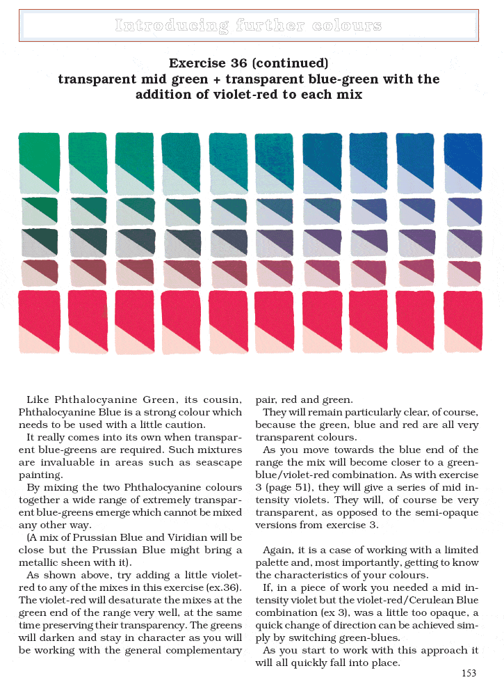
In another example, violet is mixed three different ways. Mid-intensity violets can be made by mixing either orange-red with violet-blue or violet-red with green-blue. (Either the red or the blue can carry the violet.) “Violet-red and violet-blue produce the most intense of mixed violets, and for this reason: The light that enters this mix is robbed of its blue, red, green and orange content, but the violet, which is reflected by both pigments, escapes unhindered… Red and blue are mutually destructive; that is the basis of this approach to color mixing. As the red is added to the violet-blue it removes the actual blueness, leaving the violet that it contained.”
To understand colored grays, “it will be useful to study the painting Miss Eliza Wedgewood and Miss Sargent Sketching, by John Singer Sargent, as the artist employed a series of neutralized and grayed violets to good effect. The range varied from red-violets through to blue-violets and from slightly neutralized hues through to grays. Yellow, the complementary of violet, has been introduced to add contrast as well as harmony.”
“Grays are dark or nondescript colors that do not have a strong leaning towards any particular hue. When mixed from the complementaries they are often called colored grays. Neutrals are darkened or dulled hues, such as darkened red or green… When red, yellow, and blue (traditionally thought of as the artists primaries) are combined, the subtractive process destroys almost all of the light and the mix moves towards black. The process is known as ‘subtractive’ because light is always subtracted, or removed. If the intensities of the three hues are all equally balanced, they blend into a very dark gray, approaching black. The balance, remember, refers to intensity and not the actual quantities of paint.”
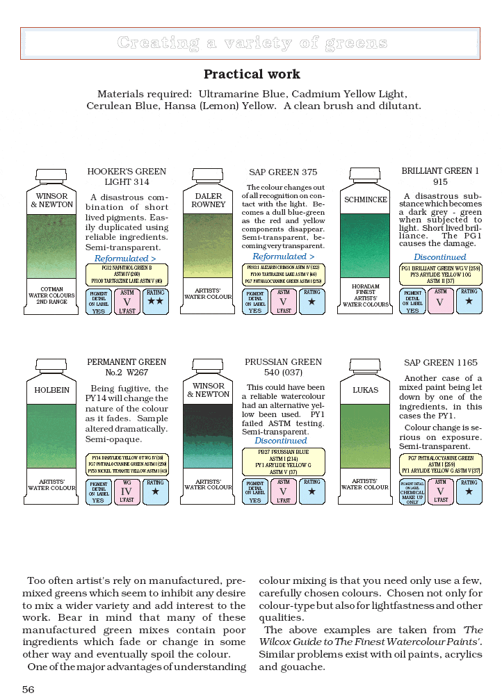
There are numerous exercises in the book as well as commentary on specific paint colors. For example, “It is most depressing to have to describe so many pre-mixed greens which are a disgrace to the profession of color manufacturing. So it is with some pleasure that I come to Pthalocyanine Green. A ‘clean’ vibrant blue-green produced by the further processing of Pthalocyanine Blue.”
The author explains how to use earth colors, including Burnt Sienna, Yellow Ochre, Raw Sienna, Raw Umber, and Burnt Umber.
“When deciding whether a particular color is a ‘brown’, remember that the general description of such colors is that they are darkened yellows, oranges, and reds… Of the brown that you use in a painting, design, or other type of work has been produced from colors already in use, the entire piece can be made to [harmonize] that much easier. In every case, the fewer colors the better.”
“Tints can be produced by either: 1) Allowing a white (or very lightly colored) background to influence thinly applied paint or, 2) By adding white paint. It is vitally important to [realize] that the brilliance of a color is damaged by adding white paint. It will also make otherwise transparent colors more opaque and add a certain ‘coolness’ to many mixes. This is particularly noticeable in watercolor painting, which relies heavily on clean, transparent, tints for much of its effect.” The author observes that watercolor purists cringe at the idea of dulling their paint with white, and yet “I can usually then find colors such as Naples Yellow in their paint box, which is basically a mixture of Cadmium Yellow and white (a convenience color which cannot be produced any other way).” The author describes the specific attributes of flake white, titanium white, and zinc white.
The author explains a way to determine the degree of opacity or transparency of paint by painting a swatch of color over a solid black line.
“Blacks often upset the balance of otherwise harmonious arrangements. What better way to darken a hue can there be than to add its complementary… Perhaps the strongest argument against [the use of black from a tube] to portray dark areas is that the final result often looks more like a hole in the painting surface than part of the work.”
“Most areas deprived of light are closer to dark gray than black and in fact black itself is seldom found in nature. Many ‘blacks’, such as animal fur, bird feathers and fruits, are, on closer inspection, seething with subdued color. Depicted with black paint they take on a dead appearance. A mixed dark invariably looks far more natural, containing, as it does, some of the light that will be reflected from such surfaces. Even the interior of an unlit room in the dead of night does not look entirely black but a deep, shifting, atmospheric dark gray.”
The author makes an analogy of complementary colors acting as dimmer switches on each other, turning down the available light. They do in fact reduce each other’s reflected light. The important thing is that the light is turned down in a natural way. The nature of the color is not destroyed, as it would be if black were to be added.”
The author also explains why understanding additive mixing (mixing of light) is helpful to a painter. “During sunrise or sunset the sky often changes in color from a yellow near the horizon to blue in the higher regions… By gradually mixing yellow into the blue during the course of a painting, an area of green is created between the two colors. You may think this is normal enough. How else can it be painted? But consider what is actually being portrayed: It is an area of the sky in which yellow light is blending in to blue light. As we know, colored lights mix additively and since yellow and blue are additive complementaries, they move towards white when they are mixed.”
Printers use four process colors: cyan, magenta, yellow, black, also known as CMYK. “The printers ‘primary’ colors can only ever give dulled oranges… This is because the red used in printing is a violet-red (magenta). As the ‘color type’ name suggests, a violet-red carries a small amount of orange. Only mid oranges can result when it is mixed with a yellow. If the yellow used by the printer happens to be a green-yellow the oranges will be even duller than if and orange-yellow had been employed.”
“One of the major advantages of understanding color mixing is that you need only use a few carefully chosen colors. Chosen not only for color-type but also for lightfastness and other qualities.”
I find color to be very complicated. This book helps to makes sense of it with a logical, scientific approach.
BY Andrew Everett (AMAZON – Verified Purchase)
amazon –
New way to think about mixing colors
What an interesting book. When I first glanced through it I thought it wouldn’t work for me. It appeared to be just a color theory book more suitable for painters, and I dye fiber. But I fairly quickly realized that Michael Wilcox has come up with a quite different way of looking at color, of understanding it, and of anticipating just how to mix colors in order to come up with the exact shade you need, which is very exciting for a dyer or anyone who works with color. In a nutshell, he notes that no primary color is truly “pure”. A blue is either a little greenish or a little on the purple side, and if you want a particular green it matters a lot which of them you use and whether you mix it with a greenish yellow or an orangey one, since of course the yellow won’t be pure either. And so on. Of course the book does contain a lot of color theory in order to explain this new way to think about mixing colors, but it’s theory that is interesting, presented well, and fascinating to put into practice. Great for dyers but I’m sure for painters too.
By MJ (AMAZON – Verified Purchase)
amazon –
I wish I’d read this book years ago!
I am a lifelong artist but did not have much experience with painting until 2 years ago. I decided to learn how to paint landscapes plein air and attended a couple of workshops for that purpose. I quickly became very frustrated because I was unable to mix the colors I needed from the paints I brought with me. The workshop leaders acted like I had some individual problem with seeing colors and managing paints on the palette, which make me think that landscape painting is something I am not good at. I persisted with studio painting, and eventually learned what was causing the paint mixing problems: the contents of the individual paint colors included more hues than I was seeing, and the combinations of these additional colors were not what I was seeking. I felt very relieved, affirmed and hopeful when I read Michael Wilcox’s color theory! Finally, I had found someone who saw the problem as I had come to see it, and who offered some solutions to it! I have improved my mixing skill considerably just by reading and understanding Wilcox’s main ideas about complementary colors canceling each other, but I have not yet learned how to reproduce the exact colors I am working towards. I plan to do all the exercises Wilcox recommends, at which time I will be better able to offer an opinion about whether his book is sufficient to teach that level of mastery of paint mixing. I would highly recommend this book to people who are learning how to paint.
By equalitynow (AMAZON – Verified Purchase)
amazon –
A must have for struggling artists
Do you struggle with mixing the right color for your painting only to end up with a blob of gray mud on your pallet? You then experiment with slightly different colors and end up with more mud? This book will explain why and how to avoid it. If you are not interested in the scientific explanations, flip to other pages that demonstrate why and how. Colorful photos and simple explanations make it easy to formulate the correct color regardless of what brand of paint your are using.
By Colin (AMAZON – Verified Purchase)
amazon –
But my elementary teacher said it made green…
An artist and mentor had recommended this book for about three years before I actually ordered it. I love it. I paint for my own pleasure and prefer to use watercolors so mastering color mixing and the concepts of transparency vs opaqueness is the key to creating something you love. This book was wonderful. Yes, it is technical and yes it does discuss some of the science involved in light and color but it is easy to read and made sense of somethings I was picking up through trial and error. It is applicable to all paint mediums and the exercises are helpful.. but mostly it changes how you think about mixing colors. Well worth the price!
By Duckie Lane (AMAZON – Verified Purchase)
amazon –
Blue and Yellow Don’t Make Green
This book was recommended by my watercolor art teacher. It has been very helpful for the often confusing results of color mixing. I’ve only just begun to use it, but I believe it will be an excellent reference tool for many years.
By Ursula E. Winters (AMAZON – Verified Purchase)
amazon –
Magic
Michael Wilcos explains how to make color, and more importantly, how to make the color you want. Color is not a mystery.
By Amygdala (AMAZON – Verified Purchase)
amazon –
Everything you learned about color is wrong
Ever mix two colors and get a gray or brownish color? Are your paint colors hit or miss?
This book is great for every painter, beginner to advanced. In school we learn about the color wheel and we mix our colors accordingly. But the color wheel is wrong! The color wheel is about mixing pure light frequencies, which paints from a tube, whether acrylic or oil, are not. The paints we use are chemicals that reflect various frequencies of light. This book goes into great detail into mixing various pigments to get the color you want.
By lorax (AMAZON – Verified Purchase)
amazon –
Excellent book
I’ve been on a quest to understand color for about a year. This book substantially increased that understanding and definitely helped my artwork, significantly.
This is an easy to read, fun book. Color can be a complex thing to understand, but this book makes that complexity fathomable. There are excellent illustrations, and even though it’s geared toward painting instead of the digital work I do, I found it very useful for my own work.
This was a book I picked up at the library and fell in love with, so off to Amazon before the due date. Why, exactly do I have a library card again?
By Craig H. Garver (AMAZON – Verified Purchase)
amazon –
The book I received was in excellent condition, and is very useful to painters
The book I received was in excellent condition, and is very useful to painters, or other working in media color. I appreciated the quality and promptness of delivery.
By J. Pfander (AMAZON – Verified Purchase)
amazon –
Presents a system that works
Before reading this book, I already had a good basis in the basic color theory: the primaries, secondaries, tertiaries, and the ideas of complementary and analogous colors. I even knew that mixing complementaries would result in browns to blacks.
However, I hadn’t learned how to apply that knowledge in the way this book presents it. As a result, sometimes I would mix colors that were muddy or shaded, and I didn’t know why. This book explains it all so clearly and so simply that you are sure to retain and use the information with ease.
In summary, this book tells you how to mix any color you want, reliably and with confidence, just using six colors, two of each primary color. Everyone who understands color knows that yellows fall on a range from almost-orange to almost green, blues fall on a range from almost-green to almost-purple, and reds fall on a range from almost-purple to almost orange. The fact that these colors are in a range means that, when you mix them, you will get different results depending on where the colors fall in that range.
This book tells how to determine where a color falls in those ranges, and also gives you a clear and understandable way of knowing what to expect when mixing different primaries. The system works.
One nice thing is that, with the price of paints today, if you need to, you can only purchase six colors and you will pretty much be set. Accordingly, this book recommends that you purchase those six colors, two from each primary, with one color each that tends toward each end of each primary (a green-yellow and an orange-yellow, for example).
Of course, you can always buy a larger range of colors, but armed with the information in this book, when you do so, you can confidently purchase and mix those colors and have a good idea of what the results will be each time.
If you are impatient with theory, you can skip all the stuff about reflected light, additive versus subtractive color mixing, color perception in the brain, and so on; it may or may not all be true, and is anyway only Mr. Wilcox’s theory about *why* his system works. Instead, if you are impatient, just read the juicy stuff about the colors themselves. It will definitely improve your ability to mix colors well. If I were making a list of “must have” books in an artist’s reference library, this would be one of them.
By Marina E. Michaels (AMAZON – Verified Purchase)
amazon –
Best book on color
“Blue and yellow don’t make green” is the only book about color and paint mixing that you will ever need. Wilcox book explains in easy to understand terms they basic principles behind color and paint mixing. Applying these principles any color mixing problem can be fully understood and solved. I can recommend this book
By John Hisken (AMAZON – Verified Purchase)
amazon –
Every aspiring painter needs to have this book!
A must-have in any painter’s library. Regardless of what kind of paint they use, watercolor, oil, acrylic, gouache – you name it. The medium doesn’t matter, the pigments all mix the same.
It’s like having a year’s worth of college level Art Theory classwork already done for you. All you gotta do is flip through the pages to find the color swatch you want to make, and it tells you what colors to use to make it.
By RH & GM (AMAZON – Verified Purchase)
amazon –
The theory is crystal clear and easy to understand and apply
If there is one book about painting colors that you should read, this is the one. The theory is crystal clear and easy to understand and apply. Excellent learning ! I should have known this 30 years ago when i started painting.
By Ironprince (AMAZON – Verified Purchase)
amazon –
New paradigm that works!
Michael Wilcox’s books will pay for themselves in the money you save on paint. This is a startling book which finally explains why some color mixes that you would expect to be good are just awful!
When I made a color wheel for a water media class I asked the teacher why some of my mixed secondary colors were so poor. She said because of student grade paints. While that may have contributed a little considering what I was using for paints at the time that was the incorrect answer! Cotman paints weren’t THAT bad. It was because neither she nor I understood the physics of paint mixtures.
Paint mixtures aren’t magic – they are a blend of light frequencies that behave in a predictable way. (Clue: The famous color wheel does not have a lot to do with it!) But people have a lot of difficulty giving up a paradigm – even if it is wrong. Time for a new one! Great book!!
By A customer (AMAZON – Verified Purchase)
amazon –
Blue and Yellow Don’t Make Green
I am very pleased with this book. It is filled with valuable information for the painter which is presented in terms that are easy to comprehend. I am currently working my way through the exercises and by doing so can already see where the book has been worth every penny. As someone well acquainted with “mud” I think the book will save me a fortune in paint down the road. I wouldn’t hesitate for a minute to recommend this book to anyone interested in painting whether new to painting or an experienced artist. We can all learn something new from it. In fact, I think it would make a great text book.
By P. Jones (AMAZON – Verified Purchase)
amazon –
It’s TRUE, Blue and Yellow Don’t Make Green!!! WOW!!!
This is far and away the best book on color and how to use it. In fact, this book is the best art instruction book I’ve ever read, it has helped improve my painting more than all the dozens of books on technique I own. If you’re serious about your art and want to know how your paintings can have the richness of color and vibrancy of the great masters then READ THIS BOOK!!! If you can only buy one art instruction book this year then this should be it.
Easy to read, easy to follow, excellent content, full of examples and exercises.
Thank you Mr. Wilcox!!!
By Amazon Customer (AMAZON – Verified Purchase)
amazon –
A must-have for painters.
Whether you’re painting for pleasure or for business, the guidance in this book is invaluable. I had long realized some of the results behind the title of this book, this explains why. Pigments and light don’t mix the same way. Chemistry is everything.
By SC Artist (AMAZON – Verified Purchase)
amazon –
I’d given up on painting until I read this book
This book really is a ‘must-have.’ I originally read the first edition of this book, which I think presents his ideas in a clear and simple way without the daunting number of color charts that appear in the current edition. But his basic insight is explained clearly in both editions, it’s easy to understand, and once you’ve read it YOU WILL BE ABLE TO QUICKLY AND PREDICTABLY MIX THE COLORS YOU WANT ON THE FIRST TRY!! And if you didn’t mix enough you will easily be able to mix more and it will match the first batch.
I had given up painting when the frustration of not being able to mix the colors I wanted took all the fun out of it. But once I read the book and ‘got it’ I was energized to try this out for myself and it paid off immediately (in this edition much of what you need to know is in the first 33 pages before the color exercises begin). Right away I could mix the colors I wanted and do it over and over. Now I am painting again and enjoying it much more. And my paintings have improved, because as he points out, paintings made with a limited palette automatically have harmonious colors. It’s surprising to learn that you can make most of the colors you need from so few colors. In art school I’d been told to use a ‘limited palette’ but nobody told me which colors needed to be in it or how many are considered a ‘limited palette.’ Here the author offers his own version which is the most versatile, and he tells you how you can modify it to suit yourself. Now that I’m in the habit of mixing colors myself I’ve also noticed that I can look at the paintings of the masters and decode how, for example, Winslow Homer could paint an entire scene with an orange-red, a greenish-blue, and white. Everything from skin tones to grey rocks to stormy blue oceans were painted with those three colors, and I can see how he mixed them and why they produced the effects that they did. As the author points out, color mixing is now a thinking process, it’s no longer hit-or-miss.
I highly recommend this book!
BY L. Becker (AMAZON – Verified Purchase)
amazon –
Must-have book for understanding colour mixing.
Like many people I imagine, I left art school not knowing much more about colour than when I went in. But eventually I was lucky enough to come across this book and my eyes were finally opened. The mistaken theories propagated by traditional colour-mixing theories have been with us for quite but this book dispels them all, at last.
In an orderly, logical manner Michael Wilcox takes us through these mistakes and points us down the path to correctly mixing a desired colour – no more will you have to “make do” – instead, by understanding the “bias” of pigments, the outcome of mixing is no longer a matter of intuition or guesswork. These techniques should be taught in every art class in every school, and it really is simple enough for this to be practical. Another beauty is that it works with any medium to accurately predict the results of a mix of any colours whose bias is known.
I cannot recommend this book highly enough for painters in any media who want to understand the mechanics of colour mixing and I thank Michael Wilcox for this cornerstone work.
By A customer (AMAZON – Verified Purchase)
amazon –
On the path to color enlightenment…..
I’m a sorter. I organize. I put things in boxes. Color doesn’t want to go in boxes. Or categories, or areas, or mix well with others. It drove me nuts. Sometimes it was too bright and sometimes it was so dull it hurt like a toothache. This book began my understanding of why color does what it does. Michael Wilcox put together a dictionary which unravels for me the complexities of color and the how’s and why’s of hue, tint, and shade. He has broken down the chemical compounds of color in an understandable way and broken the secret codes of the paint manufacturers so that you and I can read the labels. Now we can purchase exactly what colors we want and either mix our own exact shades and tints or get the individual paint supplier’s.
Ever wonder why you sweat in your sister’s bathroom and not in your’s? Her’s is painted peach and your’s is blue. Why that works, now, is someone else’s story. And then there’s black. Who knew there were so many different kinds of black? There’s a black to fit each room in your house, made out of every color in the room in which it is to reside. And it matches perfectly. Amazing.
Now when I see two shades of lemon yellow I don’t see yellow at all. I see either greenish yellow or brownish yellow and refer to them as green or brown. It’s very tricky to see the primary hue over the secondary color anymore. Huh. I guess that’s what an educated color sense sees nowadays. Never thought about it before. Three cheers for Michael Wilcox and PO3, PV15, PY3 and others! I get true colors every time.
BY Ms. Margaret J. Sinclair (AMAZON – Verified Purchase)
amazon –
The method works for me – don’t be put off by the writing style
The 12 colour palette suggested by Michael Wilcox at first had me somewhat hesitant. A simple search will show you that there are so many books on colour mixing that surely, it cannot be as simple as the Wilcox method. Despite my skepticism I tried some of the mixing exercises on the book. Creating swatches as the exercises suggested bored me so I created pictures with the prescribed colour mixes instead. I have been delighted with the results.
The economic benefit of using only a 12 colour palette is also very pleasing!
The writing style of the book is not one that flows naturally. I think this is a shame and something which could put some readers off.
Some people may also be wary of this book as there is a suite of merchandising from the School of Colour and it may appear as if purchase of their products is necessary for success. Happilly, this is not the case. Wilcox gives you all the information you need to find the 12 paints in whatever brand or media (watercolour, acrylics, oils etc) you wish.
If you have already tried other colour mixing then you may actually have many of the 12 colours in your collection.
I encourage people not to read this book and judge it, but try it and then assess whether it works for you. The true rewards are in the application.
By deLYSH (AMAZON – Verified Purchase)
amazon –
Oh! Oh! Oh! (noise made by lights in head turning on)
I’m a cheap and easy person. Instead of laboring over the mixing of hundreds of oils and scaring myself to death with the vast scenery of watercolor, I stick to pastels. The colors are reflected, right in front of me. Each stick tells me the what it is by looking at it, and I apply accordingly.
If I had realized early the mysterious properties revolving around the names of paints, my fears and my pocketbook would have seen much relief. Basically, Wilcox explains the “subtractive” method of applying color – when mixing the primary colors of red, yellow and blue with paint and ink we get black or dark brown. In the “additive method” (which applies to photographers and theatre lighting), one mixes red, yellow and blue and gets white – which is absolutely normal, since color IS light, and white is the presence of all color. The color wheel was based on a prism. Paints are NOT light; they are objects that reflect the light.
What is invaluable about this book is that Wilcox gives new meaning to the color wheel by defining the colors with paint names, taking away the doubt and fear of color mixing. If you’re a painter, just get the book. You’ll see what I mean. And you’ll save money in your choices of paints. Much more than you’ll spend on this book.
By Linda A. Goin (AMAZON – Verified Purchase)
amazon –
Important book for learning about colour mixing
Like many people I imagine, I left art school not knowing much more about colour than when I went in, my teachers’ ignorance of many colour issues as profound as mine. Eventually I was lucky enough to come across this book and it helped me gain a much better understanding of the reasons for varied mixing outcomes. The inaccurate methods propagated by traditional colour-mixing theories have been with us for quite a while and this book is a very good beginning to overcoming many of them.
In an orderly, logical manner the author takes the reader through many mistakes and points you down the path to more reliability in mixing a desired colour – no more will you have to “make do” – instead, by understanding the bias of pigments, the outcome is no longer a matter of intuition, or worse, guesswork. These techniques should be taught in every art class in every school, and it really is simple enough for this to be practical. Another beauty is that it works with any medium.
This book is highly recommended for learners looking for better insight into practical colour mixing.
Note: the technical explanations underlying the ideas in the book are simplistic and not scientifically accurate, so should be taken as a rough guide only.
By E. Rees (AMAZON – Verified Purchase)
amazon –
Begining oil painter. What color paints should you buy…read this book first.
First off, read the book, buy the paint colors suggested, then start mixing and make your own color chart. Then decide if the book is worth it or not. If mixing colors has been a chore instead of a joy buy this book.
Like other reviewers, I saved lots of money and headaches using the principles in this book. No, it does not have pictures of pretty artwork. You provide the artwork. I thought I knew how to mix colors. I used acrylic paints and guessed at what I wanted. Now I know how to get what I want out of any paint media. It is the only book about mixing color you will need. Read on for more about the book.
Let me tell you as a beginner oil painter it was maddening to try and figure out what color paints to buy. I have checked out, borrowed and brought several books on oil painting and color over the last few months. It was very confusing on what type and color of oil paints to buy. Each painter in each book had their own colors and brands they used. When I finally got the money together to order my paints I spent all day trying to wade through the color chips on the Internet and the books that I had. Of course unless you have the paint color in front of you on a canvass, you can in no way or how figure out the true color of the paint your buying.
I was lucky to have come across the Colour Bias System (called the six color system which is confusing because I thought that was the old color wheel system) on another artist’s website who was nice enough to provide a short explanation and tell what colors she used. Unfortunately the colors she suggested did not match up with the names of the water-soluble oil brands I was interested in using. I was very excited to learn how to get a pink instead of a coral, and how to get a true green and not a sap green or get a sap green if I wanted it. Still I had the problem of which colors to order.
After much digging around on the Internet I found Talen’s website. They make H2o water soluble oils. It has listed the names of their primary and secondary paint colors for the Colour Bias System. The primary colors are equal to the colors in ink for a printer – cyan, magenta, and yellow. The term secondary is not used in the traditional sense of green, orange and purple but, the other yellow, red and blue to use with the Colour Bias System. I jumped on that information and ordered my paints from them just because now I knew what to order.
It was a leap of faith because the colors were not what other artist where saying to use. I did not order any greens, trusting to what I had read about the Colour Bias System. I ordered the two yellows, the two reds, and the two blues, plus white, and burnt umber.
I just finished my first oil painting and I am please to tell you the Colour Bias System works. I made my own greens and was more than please with how they turned out.
Now comes in the book Blue and Yellow Don’t Make Green. For some reason Blue and Yellow Don’t Make Green was always checked out of my local library and I just came a crossed it.
If I had read it from the first I would not have been so scared when I got my paints and saw the colors. I just about fainted. I thought I had made a big mistake until I started mixing paint for my own color chart. Now I could see how it all worked. Blue and Yellow Don’t Make Green would have made it easier to figure out how all the colors interact. It is not a matter of warm or cool it is a matter of orange-red verses a violet-red and so forth.
The pages describing paint colors to use, their pigments, and how and why to keep you pigments as pure as you can keep them is priceless. The Colour Bias System color wheel in the book makes it easy at a glance to remember which colors have what underlying tint and what colors work with and against each other. I like the addition of the other color charts. It does not bother me that the color charts lean to watercolors. You should have seen the color book I checked out for oil paints. Ugly! I am mixing my oils described the way in the book with beautiful results. I love clear clean colors and am getting them with the lest expensive oils. No book that I have gotten has or can produce true color charts that match perfectly with original paints. The printing process just does not allow it.
I was just at the art department of one of the biggest universities in the nation. One class was on color and the students were making a color chart with oils. I did not see one example of a student’s work that was not all muddied. Thousands of dollars for an education and I have learned more about color from this book than those students will in that class.
The reason I gave the book four instead of five stars is that it gets too technical with color absorption and reflection. It could have been explained in a simpler manner and the principle was over worked.
By Amazon Customer (AMAZON – Verified Purchase)
amazon –
Makes color mixing cristal clear
This book is great. As a hobby, I started painting a little over a year ago. However, after investing hundreds of hours and dollars, I was on the verge of giving up painting all together because of the frustration resulting from failing to mix colors accurately, wasting time, money and going nowhere. In his book, Mr. Wilcox, starting from the color pigment level, clearly explains to us the entire color mixing process with thousands of examples backed by illustrated scientific information, and takes out the guess work, thus allowing the artist to concentrate on the composition. After reading this book, my colors are now a hundred percent accurate with colors ending up on canvas rather than in the trash. The only critisism I may have is his continuous repitition of the evils and shortcomings of traditional color-mixing theory. Other than that, thank you Mr. Wilcox for bringing back the joy of painting.
By Gayle S. Ataceri (AMAZON – Verified Purchase)
amazon –
Really understanding color mixing
I thoroughly enjoyed this book. After studying the whole book I have a different understanding of color mixing and I think moving forward, as I paint, I will be able to make the colors I am thinking of without so much ‘repainting’. I paint mostly with acrylics. I almost never read an art book cover to cover. I will use this book for many years I am sure. Usually I am not so systematic but after this book, I may be changing my ‘color’.
By Jo A. El-assal (AMAZON – Verified Purchase)
amazon –
If you want to understand why some colors blend with others and make a perfect new color or why they get “muddy” then this …
This book will open your eyes on color. I am fascinated by the content! If you want to understand why some colors blend with others and make a perfect new color or why they get “muddy” then this is the book for you!
By nadine (AMAZON – Verified Purchase)
amazon –
THE Desert Island Art Book
This book makes so much sense, works so well, and shows the conventional color wheel theory to be so flawed that it has changed my life as an artist.Essentially the book presents how to mix colors based upon what actually goes on it pigments, not according to what you think you know about conventional color theory. If you mix yellow and blue for instance, you are supposed to get green. Try mixing cadmium yellow and ultramarine blue then! You get a brownish drab color that can barely pass for green. Why? His answer is a revelation that will empower you as a confident mixer of color. You will learn from this book what it takes artists years to learn thru trial and error.
Anyone who says this book is too difficult or covers old territory hasn’t read it carefully. This is the most important art book you will every read. You will come away “empowered” rather that overpowered by color.
Added Note:(Another reviewer panned the book claiming Wilcox misused the terms “warm” and “cool”. Nonsense. HE NEVER ONCE USES THE TERMS WARM OR COOL. His explanations show that whole approach to be inaccurate. I have a degree in science and his science is first rate. Some reviewers must have read a different book than I read.)
By Nigel (AMAZON – Verified Purchase)
amazon –
Get this book
If you are in an art class and feeling like there is something wrong with the instructions,then don’ be discourage. Its not you!!! Do yourself a favor and get this book. The majority of college art instructors can’t paint or draw but they can BS like a used car salesman. This book will get you on the right track as far as color mixing is concern. Guaranteed!!!!
By Amazon Customer (AMAZON – Verified Purchase)
amazon –
Revolutionary Clarification on Color Mixing
Mr. Wilcox clears up centuries of hit and miss color mixing techniques. Before the theories presented in this work, learning how to mix colors used to be trial and error over and over again until memorized, usually just as Social Security kicked in. The text covers the basics of how light and color work together. Wilcox takes the next logical step and combines those principls with basic color-wheel theory and in doing so answers many questions that baffle beging painters and colorists in general. More illustrations of completed works utilizing these ideas would have made the book easier to warm up to but the concepts are just as effective nonetheless.
By Bradley T. Combs (AMAZON – Verified Purchase)
amazon –
Stop mixing mud. Wonderful artist’s cheat sheet.
Stop supporting the paint manufacturer. You don’t have to buy every colour. Learn to mix your own vibrant hues and not mud. Even artists on the tightest budgets will find this a worthy investment.
By A customer (AMAZON – Verified Purchase)
amazon –
one of the few practically useful books on the subject
Had I gotten my hands on this book three or four years ago, I would have saved much money on other books and on paint. I would also have spared myself hours and hours of frustration trying to match the color in my mind with a color on a canvas. In short, this is the only genuinely useful book on the subject of color mixing of at least two dozen that I have read. It is also the first to give me the sense that I understand what I am doing. Finally, buying paint is a new experience when I actually know exactly what I am looking for (and what not).
By A customer (AMAZON – Verified Purchase)
amazon –
Best Introduction to Color Mixing
This book does not cover Color Theory, which is a specialized branch of color use. Instead, Blue & Yellow Don’t Make Green addresses some of the basic issues of color mixing, in terms of both light and paint. It clearly explains the physical properties of each and how this knowledge can be used to best effect.
Yet, the text is never dry or overly-scientific. It cuts right to the chase, giving the reader plenty of information about color mixing, along with many beautiful color illustrations.
As an artist and teacher, I use Blue and Yellow both in the studio and in the classroom all the time. My hat is off to Michael Wilcox!
By A customer (AMAZON – Verified Purchase)
amazon –
Highly Recommend the book
Highly Recommend the book. It has answered questions I’ve had for years. My colors zing now where before I would make mud and didn’t know why.
By &*&*&* (AMAZON – Verified Purchase)
amazon –
Blue and Yellow don’t make Green a wonderful book about color
I attended a three-day workshop during which time we learned about the school of color and the method Michael Wilcox uses to understand color. The book is a must for anyone who wants to understand his theory of color.
I plan to spend most of the summer studying this book. I love the book
Blue and Yellow don”t make Green.
By Wilma F. Irwin (AMAZON – Verified Purchase)
amazon –
A useful pack of lies
This is a straight-talking, practical guide to color mixing that’s likely to be helpful to artists working in all kinds of media.
However, the book’s explanation of basic color mixing theory is inaccurate — or to be more charitable, it’s a metaphorical interpretation. Wilcox rails and rails against the evils of the “erroneous” three-primary system; it is a delicious irony that the book’s luscious color mixing examples were printed with just such a three-primary system (plus black).
My only beef with this very interesting book is that it doesn’t fess up to its own allegorical nature, of which Mr. Wilcox is mostly likely quite aware. Don’t read this book and then think that you now understand how color mixing and color perception actually work; just use it to mix paints to get the color you want! If you want to really understand color perception, you’ll have to unlearn much of what this book tells you
By Garth Snyder (AMAZON – Verified Purchase)
amazon –
full-color eye opener!
If you have trouble putting a clean brush in new paint, this will inspire you to systematically succeed in making a beautiful mark on clean watercolor paper — in just the color you hoped for. There’s a method to making a watercolor come out looking beautiful — it’s in the way the colors are made, lay over each other, and blend (or not). Here’s how. And it’s easy to learn. Go for it!
By A customer (AMAZON – Verified Purchase)
amazon –
you can’t go wrong with this one.
I must have been absent the day they taught about color in school. Of course, I knew what a prism was but I had renewed respect for Newton after I read this book. what research!
The color wheels were a little challenging to apply but the book is a treasure and if I can locate it, I plan to give it to my friend who is also into watercolors
By Amazon Customer (AMAZON – Verified Purchase)
amazon –
Good stuff!!!
I believe that this is a seminal work in the history of art. Michael Wilcox explores the physics of color mixing, and why it is that if you mix blue and yellow, you might not get green. Artists buy ten blues and ten greens, and STILL don’t get the hue they want. If you want to understand WHY, BUY THIS BOOK!
A true classic!
By Robert Garrett (AMAZON – Verified Purchase)
amazon –
A color reference for the serious artist
This book’s central lesson is: “Color mixing should be a thinking process based on knowledge.” This book discusses the physics of color and light. It has pages and pages devoted to the properties of various colors, and what will happen when you mix Color A and Color B. I just wish this were a lightweight paperback so I could throw it in my painting kit.
By cherab (AMAZON – Verified Purchase)
amazon –
Awesome…a revelation
I came across this book in a local bookstore and read it cover to cover, spellbound and thrilled. The traditional color wheel is so much antiquated voodoo. Wilcox shows that color mixing should be based on a knowledge of the physics of color and pigments. Outstanding.
By A customer (AMAZON – Verified Purchase)
amazon –
It’s about time!
This is a great book. No more wasted paint and confusion (or even depression) about colour mixing. Good colour mixing is a complex and confusing business but this book goes a very very long way to make it far less so and more logical and accurate. It’s gives excellent results. Read it, buy it, learn it!
By nickd (AMAZON – Verified Purchase)
amazon –
Changed my way of looking at colour
I have been painting for about 5 years now and had my fair share of failures, mainly due to mixing mud. This book takes you down a diffrent path and explains where I was going wrong,in an easy to understand way, it has changed my aproach entirly. I Use it in conjunction with is mixing pallete and paints and am delighted with the results.
By david hunter (AMAZON – Verified Purchase)
amazon –
Finally – colors make sense.
This ia a fabulous book for any artist or aspiring artist. From a pallet of only 12 colors he show you the hows and especially the whys of mixing just about any color you want. Especially good for water colorists. You’ll never be mixing “mud” again.
By Benjamin W. Albert (AMAZON – Verified Purchase)
amazon –
Must-have book for all artists!
I have taught Color & Color Theory for 20 years and this book is great. It changed my approach to teaching color mixing. My students leave my class well-prepared to mix any color they desire.
By A customer (AMAZON – Verified Purchase)
amazon –
Forget what they told you in art school
Excellent explanation of the way paints work visually. Once you understand this concept, you will be able to mix the colors you want every thing without struggle or wasted paints.
By Charlotte R. Alexander (AMAZON – Verified Purchase)
goodreads –
This book debunks the myth of the traditional three primary colors being able to mix all the secondaries. Wilcox introduces a color wheel with two of each of the primaries (yellow-green, yellow-orange, red-orange, red-violet, blue-violet and blue-green) and talks in depth about why we see colors the way we do and what is actually happening when we mix colors. He makes an interesting argument for limiting our palette to twelve basic colors from which we can mix all the colors we will ever need. It certainly would be cheaper than buying all those many expensive tubes of paint with their mysterious names. One quibble I have is that he sticks to the traditional complementary colors, which tend to mix into browns intstead of greys. For a discussion about the “new” color wheel see http://www.reralcolorwheel.com or read Color and Light by James Gurney.
By Diane (goodreads – Verified Purchase)
goodreads –
Good common sense color theory. I originally gave it three stars because it was kinda repetitive, but upped it to four because it’s great information and really straight forward.
There’s an exercise (I’m 90% sure was from this book,) where you mix every possible color combination on your palette. Now that I think about it, I’m only 50% sure it was from this book. But it’s more fun and interesting than it sounds. It was a great way to learn about the strengths of colors you choose and make comparisons.
By Mirian (goodreads – Verified Purchase)
goodreads –
OK, this is for artists! Wilcox begins with a review of light and how we see color. Then he presents a more modern (and accepted) theory about color mixing versus the traditional concepts of the three primary colors: red, blue and yellow.
Wilcox seems to present the material as if it is his theory alone. But that is not my understanding. Regardless, it seems to make perfect sense and I look forward to making less muddy colors and taking a workshop from Susan Fisher on color mixing early next year.
By Gale (goodreads – Verified Purchase)
goodreads –
Clears up the mystery about color mixing… points you in the direction to quickly get the colors you want with the minimum of hassle.
The book is written with a style that gets a bit redundant, but I believe that is to drive the point across, as it is fighting a long-entrenched theory that has warped artist’s thinking toward color theory.
I am already starting to see positive results!
By Todd Cumpston (goodreads – Verified Purchase)
goodreads –
This is an awesome book for art nerds; it explains how the pigments in your paint work and gives you a great technique to make mixing your colors faster, easier, and more accurate. It gets a bit redundant at times, and I deducted a star for that, but it explains so much about color and answers a lot of questions I’ve always had about how mixing colors works. Awesome read!
By Kimberly (goodreads – Verified Purchase)
goodreads –
Excellent reference book for mixing pigment colours. It explains how to mix different qualities of colours starting with the biased colour relationships using warm and cool versions of each primary colour.
By Carmel (goodreads – Verified Purchase)
goodreads –
I highly recommend this book to any artist who wishes to master color. This book is full of clear explanations and valuable exercises. I’m going to read other books about color and painting from the author.
By Anastasia Peacefull (goodreads – Verified Purchase)
goodreads –
An important look at the practical rather than the theoretical side of mixing colors. An excellent reference book.
By Bruce Jones (goodreads – Verified Purchase)
goodreads –
I’ve learned to properly mix colors with this book. Easy to follow and extremely helpful. Saved a bunch of money learning to mix with a few essential colors.
By Velour (goodreads – Verified Purchase)
goodreads –
If you are into Color Theory, you have to get this book. Totally explains why and how to mix color. Great for students or teaching color.
By Stacie (goodreads – Verified Purchase)
goodreads –
Such a great reference book for color mixing. I will have to buy this one for reference! Nice discussion and examples for watercolor, acrylic, and oil painting. Pastels discussed as well.
By Sheree (goodreads – Verified Purchase)